It is not enough to just have an effective email marketing material, to simply send the information about the product you are promoting. Letting your target recipients know about the products you are marketing does not guarantee that they will become customers. Your email marketing effort comes with the need to create a landing page that can yield excellent customer conversions. Even Wikipedia puts prudent efforts in coming up with landing pages. The goal should be to convince the visitor or prospective customer to buy or avail of what is being offered by presenting an inviting and convenient interface.
A landing page is the web page where a visitor or potential buyer is brought to after clicking on an ad or a link from a marketing material. It is the crucial page that could either convince or discourage a potential customer to buy or at least proceed into learning more about the products being offered. As such, it has to be carefully created or designed. The following pointers will help you create the perfect landing page to complement your email marketing efforts:
1. Use a Responsive Design

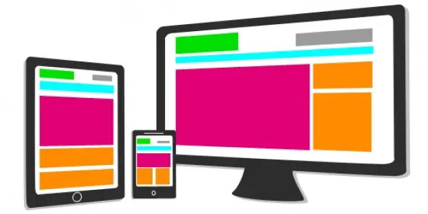
Responsive design is encouraged for landing pages in the same way it is promoted for typical websites. For the uninitiated, responsive design is a type of design that makes it unnecessary to have different versions of web pages to optimize viewing. With responsive design, a page can look great whether it’s viewed on a desktop (bigger display) or on a mobile device (smaller display or lower resolution). It automatically adjusts page elements to make them comfortable to view and browse regardless of the screen or display size.
A landing page is expected to look great no matter what device is used to view it. Obviously, you can’t expect all of your potential visitors to use a desktop or laptop to view your ads and head to your landing page. Those who access the web through mobile devices are a considerable number. You simply can’t ignore them. While it’s true that you can have m-dot (mobile versions) for all of your pages, such a solution is not as efficient as simply using a responsive design.
2. Present a Combination of Attractive but Cohesive Colors and Design
Of course, this one’s a given. To have an attractive design, you need the right colors and layout. Consult design guides for this if you are unsure of what to do. You can also use a landing page creator tool to generate a landing page almost instantly. Tools like this usually come with a multitude of templates that feature design “best practices.” They can offer pointers on how to go about with your landing page design quickly, with just a few clicks. Just be sure, though, to observe good and prudent judgment to make sure that the design you produce does not look generic. The last thing you want to do with your landing page is to make it look just like every other landing page online. You also need to infuse some personality or distinctiveness to make your product or brand identity stand out.
3. Add Images
Ask yourself: would you pay attention to a marketing material that shows nothing else but blocks of texts and some occasional borders or colored boxes? You know the answer. You need images on your marketing materials and you certainly need them on your landing page. Brevity and the use of images are vital for a successful marketing campaign. Be sure not to overdo it, though. You have to make use of the right or appropriate images. Also, make sure that you don’t get yourself into trouble by using copyrighted images. There are many sources of high quality free images online. You just have to use some patience to find them.
4. Add Built-in Web Forms and Other Interactive Elements
For better engagement, incorporate web forms on your landing page or other types of interactive elements. A landing page that encourages interaction will most likely keep a prospective customer longer on the page instead of immediately leaving upon seeing a bare and uninspired page. You can also add polls or even some light games related to the product you are marketing.
5. Employ A/B Testing
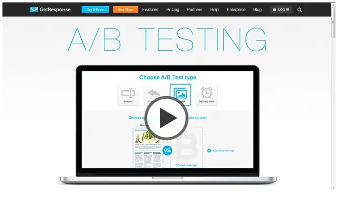
Don’t expect to get everything right on your first attempt. The landing page you think is already perfect could still be optimized. You can use A/B testing to find out the right adjustments to do. If you are using email marketing tools, some of them already employ A/B testing for the landing page. Yes, the A/B testing process could mean additional work but if you are serious about creating the best landing page you could possibly create, it certainly is worth it.

Screenshot of the official GetResponse website
You will be nullifying the effectiveness of your marketing campaigns if you don’t exert enough effort in making your landing page provide a pleasant experience for your prospective customers. You have to make sure that it is quick-loading, intuitive, pleasant to the eyes, easily navigable, filled with excellent content (text), and well-coded to make sure that it renders properly on the different web browsers in various devices.
[Image credit: Jean-Michel Gariepy, Flickr]

Great points! Responsive design is a must nor just for landings, but I strictly agree witht the A/B testing. Many people underestimate it’s importance, but having tried it for myself – I can say that it can improve your page’s performance by 50 – 150 % – and the changes are not always so obvious. So it’s always better to test than to guess