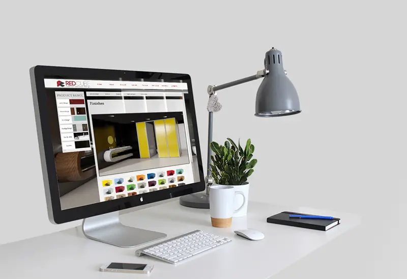
When designing a website, of course, you’re going to want to create a site design that looks great. But, creating a gorgeous web design doesn’t necessarily go hand in hand with creating a professional-looking website.

In fact, many site designs that are visually pleasing don’t always create a good first impression to potential customers or business partners. A lot of these sites cause visitors to leave, simply because the site’s visual design is overwhelming.
On the other hand, there are websites that are simply too boring to look at, which prevents customers and other businesses from trusting the website because it looks like it was created by an amateur.
Essentially, a website’s design needs to look professional, as well as being simple for visitors to use and navigate. Take City Tech company‘s website for example. Upon landing on their homepage, you instantly see that the website is simple, clean, and not overwhelming whatsoever.
Below, we’re going to go over a few important tips for creating a simple, and gorgeous website design.
1. Create High-Quality Copy
Many people believe that written copy isn’t really an essential part of a website’s design. However, anything that’s written on your website plays an important role in making your site look professional, as well as determining what people will think when they visit it.
In the real world, the quality of a person’s writing speaks volumes about their level of professionalism. Therefore, the same thing applies to your website’s copy.
If the site’s content is full of spelling mistakes, poor grammar, and awkwardly written sentences, potential customers will be able to tell that the website was not created professionally. And, most of the time, visitors will bounce when a website’s copy is written poorly.
Of course, writing isn’t always the easiest thing to do. Therefore, it might be a good idea to hire a professional content writer to ensure that your web copy is well-written and professional.
2. Use Large, High-Quality Images
Large images are known to slow down a site’s speed, however, they are also an essential aspect of making your site’s design stand out from the competition.
So, when you use large, high-quality imagery as part of your design, your website is guaranteed to look more professional. Large images tend to attract website users, which can be used to lead them to your CTA or Call to Action.
3. Only Use a Single CTA
Using too many CTAs in another way that you can quickly make your site seem less professional.
When you have too many actions that you want your visitors to do, they’ll likely be confused and not end up clicking or doing anything at on your website.
Ideally, your site should only use a single CTA, which makes it easy for visitors to know what you want them to do.
Just make sure to place your CTA somewhere that’s highly visible and use graphics to accent what you want your visitors to do. Not only does this makes things easier for them, it also makes the entire site seem more professional.
4. Simplify Navigation
Creating an enjoyable user experience should always be one of your main priorities when trying to design a high-quality website. Therefore, it’s vital to create a design that is easy for your visitors to navigate.
Most website visitors only stay on a given page for a few seconds, or minutes at most. So, if your website isn’t well-organized, your visitors will likely get lost, end up frustrated, and avoid visiting your site ever again. Navigation can be tricky to design effectively, however, so it’s worth searching for web design melbourne services (or similar services near you) to get a professional web designer on the case.
5. Keep It Simple
Many time, web designers get carried away with using borders, shading, and adding way too much color to their sites. And, when a website is visually overwhelming, visitors will likely have a hard time looking at it and will likely bounce off to another site.
We’re currently in an era where minimalism is becoming more and more popular. Therefore, web designers should adopt this same minimalistic approach when creating a website.
As opposed to using tons of flashy graphics and elements, it’s much better to make sure that a site has plenty of white, or negative space, which allows the site’s overall design to breathe better.
Without any negative space, sites tend to look cramped and can be overwhelming to its visitors. Therefore, it’s a better idea to keep things simple, which will prevent visitors from being scared off by a visually overwhelming design.
[Image via: Google Images]
